


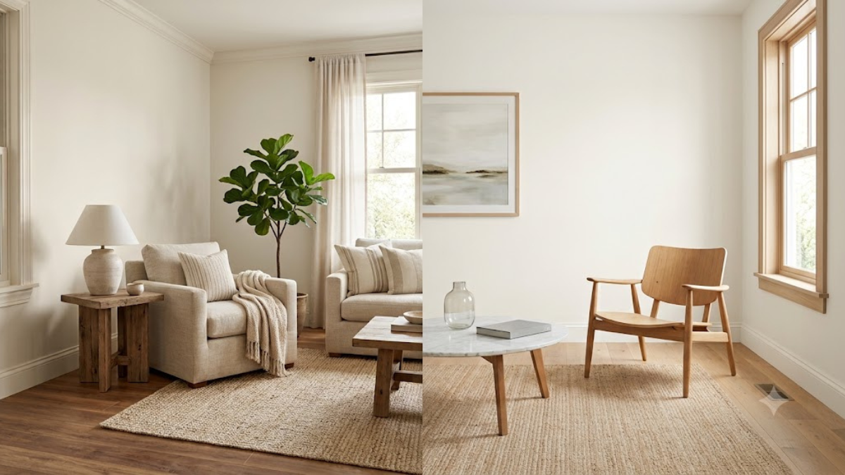
Choosing between Sherwin-Williams’ top warm neutrals? Discover the differences in undertones, LRV, and lighting behavior in this Shoji White vs Alabaster guide.
If you’ve spent even ten minutes scrolling paint inspiration on Pinterest or Instagram, you’ve probably run into this exact debate: Shoji White vs Alabaster. Both are Sherwin-Williams staples, both are beloved by designers, and both promise that soft, cozy, “not-too-stark” white that so many homeowners are chasing right now. But here’s the thing — they are not interchangeable, and picking the wrong one can throw off an entire room’s mood.
This comparison comes up so often because these two colors sit in a similar family. They’re warm, they’re versatile, and they photograph beautifully. But once you get them on your actual walls, under your actual lighting, next to your actual furniture, the differences become pretty obvious. So let’s break down Shoji White vs Alabaster in a way that actually helps you decide, rather than just repeating marketing copy from a paint swatch card.
We’ll walk through undertones, lighting behavior, room suitability, and how each color plays with trim, cabinets, and flooring. By the end, you’ll know exactly which one deserves a sample pot on your wall this weekend.
What Is Shoji White, Really?
Shoji White (Sherwin-Williams SW 7042) is often described as a “greige” — a blend of gray and beige — with warm undertones that lean slightly toward yellow and green depending on the light. It’s named after traditional Japanese shoji screens, which have that soft, paper-like glow, and honestly, the name fits. This color doesn’t scream for attention; it just quietly makes a room feel warmer and more grounded.
What makes Shoji White such a popular choice is its chameleon-like quality. In natural daylight, it can look like a warm off-white. Under artificial light in the evening, it can shift toward a soft beige or even a light taupe. This flexibility is exactly why so many designers reach for it in homes with mixed exposure — rooms that get both morning sun and evening lamp light. If you want a wall color that feels alive and changes personality throughout the day, Shoji White is a strong contender.
What Is Alabaster, Really?
Alabaster (Sherwin-Williams SW 7008) is arguably one of the most famous whites in the design world, largely thanks to Joanna Gaines and the farmhouse aesthetic boom. It’s a soft, creamy white with the faintest hint of warmth, but it stays remarkably neutral compared to Shoji White. Where Shoji White can lean beige or greige, Alabaster stays closer to a true soft white with just enough warmth to avoid feeling clinical.
This is precisely why Alabaster has become the go-to trim and ceiling color for so many homes, even ones that use a different wall color entirely. It reads as clean and bright without the coldness of a stark, blue-based white. When people compare Shoji White vs Alabaster, this is usually the core tension: Shoji White brings depth and warmth, while Alabaster brings brightness and simplicity. Neither is “better” in a vacuum — it depends entirely on the vibe you’re going for.
Shoji White vs Alabaster: Undertones Explained
Undertones are where most paint decisions go wrong, and this comparison is no exception. Shoji White carries subtle green-yellow undertones that can become more noticeable in rooms with a lot of natural wood or green plants nearby. It’s not a color that fights with warm materials — it tends to blend into them, which is why it works so well in living rooms and dining spaces with wood furniture.
Alabaster, by contrast, has a much more subtle undertone that leans faintly yellow but almost never reads as green. This is part of why it feels so safe and universally flattering — it doesn’t clash easily with other colors in a room. When you’re weighing Shoji White vs Alabaster specifically for undertones, think about what’s already in your space. Lots of warm wood tones and earthy accents tend to favor Shoji White, while spaces with cooler grays, whites, or black accents often look cleaner with Alabaster.
Shoji White vs Alabaster: How They Look in Different Lighting
Lighting can make or break either of these colors, and this is honestly the biggest source of confusion for homeowners. Shoji White has more depth to it, so in north-facing rooms with cooler, indirect light, it can start to look a bit gray or even slightly green. In south-facing rooms flooded with warm sunlight, that same wall can look like a rich, cozy beige.
Alabaster tends to be more forgiving across different lighting conditions because it has less pigment intensity overall. In dim rooms, it can look a touch gray, but it rarely shifts dramatically the way Shoji White can. If you’re someone who wants a color that behaves consistently no matter what room you use it in, Alabaster is generally the safer bet. But if you enjoy a wall color with a bit of mood and personality that shifts through the day, Shoji White has more character to offer.
“Paint doesn’t exist in a vacuum — it exists in your light, your furniture, and your life. The right white isn’t the trendiest one, it’s the one that matches how you actually live in the room.” — a common sentiment echoed by interior designers when clients ask about warm neutral paints.
Shoji White vs Alabaster: Which Rooms Work Best
This is where the Shoji White vs Alabaster debate gets genuinely practical. Shoji White tends to shine in living rooms, dining rooms, and entryways — spaces where you want warmth and a slightly moody, layered feel. It also pairs beautifully with open-concept homes because its adaptability means it won’t look jarring as it moves from a sunlit kitchen into a shadier hallway.
Alabaster, on the other hand, is a favorite for kitchens, bathrooms, and bedrooms where a fresh, airy feeling matters more than warmth or depth. It’s also the unofficial champion of trim and ceiling paint because it brightens a space without introducing a stark contrast against warmer wall colors. Many homeowners actually end up using both — Shoji White on the walls and Alabaster on the trim — which sidesteps the “versus” debate entirely and lets each color do what it does best.
Shoji White vs Alabaster: Pairing with Trim, Cabinets, and Decor
Choosing between Shoji White and Alabaster also comes down to what you’re pairing it with. Shoji White works wonderfully alongside deep wood tones, black hardware, and earthy textiles like linen or jute. It has enough warmth to feel intentional next to natural materials, which is why it’s a favorite in modern farmhouse and organic modern interiors.
Alabaster, meanwhile, pairs beautifully with crisp whites, soft grays, brass fixtures, and pastel accents. Because it doesn’t lean heavily in any one undertone direction, it acts almost like a blank canvas, letting your furniture and decor take center stage instead of competing with the wall color. If your home leans more coastal, transitional, or minimalist, Alabaster will likely feel more at home than the deeper warmth of Shoji White.
Shoji White vs Alabaster Comparison Table
| Feature | Shoji White | Alabaster |
| Undertone | Warm beige-green | Soft, neutral warm white |
| Best Lighting | South-facing, warm light | Works well in most lighting |
| Mood | Cozy, layered, grounded | Bright, clean, airy |
| Common Use | Walls, accent rooms | Trim, ceilings, cabinets |
| Pairs Well With | Wood tones, black hardware | Brass, gray, pastel accents |
| Style Match | Modern farmhouse, organic modern | Transitional, coastal, minimalist |
Seeing Shoji White vs Alabaster side by side like this often makes the decision much clearer. If your priority is warmth and depth, Shoji White wins. If your priority is brightness and flexibility, Alabaster takes the lead.
Real Homeowner and Designer Quotes
Homeowners who’ve actually lived with both colors tend to have strong opinions, and their feedback is often more useful than a swatch card ever could be. One renovator put it simply:
“I painted my living room Shoji White expecting a soft gray, and instead got this beautiful warm greige that changes throughout the day. It’s honestly become my favorite room in the house.”
Another homeowner who chose Alabaster for a full main-floor repaint shared a different experience:
“Alabaster was the first white that finally didn’t look cold in my north-facing kitchen. It’s soft, it’s clean, and it goes with literally everything we own.”
These real-world reactions highlight exactly why the Shoji White vs Alabaster comparison isn’t about which color is objectively superior — it’s about matching the color to your specific lighting, furniture, and desired mood.
Common Mistakes When Choosing Between Shoji White and Alabaster
One of the biggest mistakes people make is choosing a color based purely on how it looks online or in someone else’s home. Paint colors are heavily influenced by lighting, wall texture, and even the colors of nearby rooms, so a shade that looked perfect in a friend’s sunlit kitchen might look completely different in your dimmer hallway.
Another common misstep is skipping the sample stage entirely. Both Shoji White and Alabaster can shift noticeably depending on the time of day, so painting a large swatch — ideally on more than one wall — and observing it morning, afternoon, and evening will save you from a costly repaint. It’s also worth testing these colors next to your existing trim, flooring, and furniture rather than in isolation, since undertones become far more obvious once neighboring colors enter the picture.
Conclusion About Shoji White Vs Alabaster
At the end of the day, the Shoji White vs Alabaster decision comes down to warmth versus brightness, depth versus simplicity. Shoji White offers a cozy, ever-shifting greige that feels grounded and layered, making it ideal for living spaces filled with natural wood and warm textures. Alabaster, meanwhile, delivers a clean, bright, endlessly flexible white that plays well as both a wall color and the ultimate trim companion.
Neither color is a wrong choice — they simply serve different moods and different homes. The smartest move is to sample both directly in your space, watch how they behave across your lighting throughout the day, and trust what actually looks good in your home rather than what trended online. Whichever you choose, both Shoji White and Alabaster have earned their reputation as two of the most reliable, livable whites in the paint world.
Frequently Asked Questions About Shoji White Vs Alabaster
Is Shoji White warmer than Alabaster?
Yes, generally speaking. Shoji White carries more noticeable beige and green undertones, making it feel warmer and deeper, while Alabaster stays closer to a soft, neutral white with only a whisper of warmth.
Can I use Shoji White and Alabaster together in the same home?
Absolutely, and many designers recommend exactly this. Using Shoji White on walls and Alabaster on trim or ceilings creates a cohesive look while letting each color highlight its own strengths.
Which color is better for small, dark rooms?
Alabaster tends to work better in smaller or dimmer rooms because it stays brighter and less prone to looking muddy in low light, whereas Shoji White can occasionally read gray in cooler, indirect lighting.
Does Shoji White look gray or beige?
It can look like either, depending on lighting. In cooler light it leans gray-green, while in warm natural light it leans beige, which is part of what makes Shoji White such a versatile, mood-shifting color.
Is Alabaster too bright for a cozy feel?
Not necessarily. While Alabaster is brighter than Shoji White, it still carries enough warmth to avoid feeling sterile, especially when paired with soft textiles, warm lighting, and natural wood accents.
